Thanks to the integrated blog, the site visitor is always quickly informed about the latest news. The icon font (icons are writing) needs little memory and leads to sharp icon display on all devices.
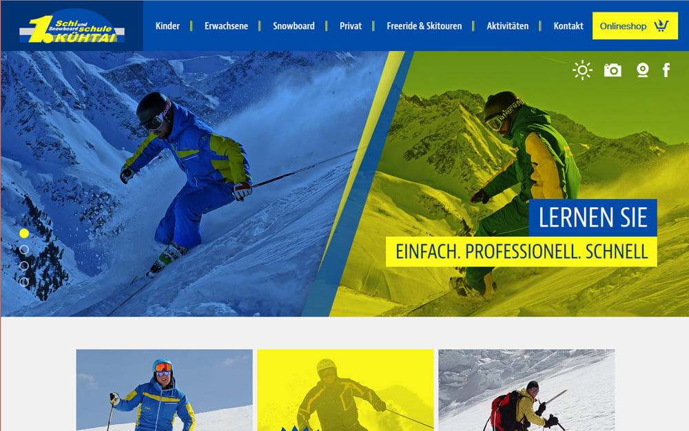
The colors - blue and yellow - from the logo of the Ski School Kühtai can be found in numerous website elements and increase the recognition value: in the header images, in the H1 headlines with HR for better readability, in various content elements (info boxes), in the embedding of the content images (with motion effect on mouseover). The content sliders and tiles on the start page are also in yellow-blue and allow to highlight special offers of the ski school in addition to the menu navigation.
The TYPO3 extension built by our web department - gallery with subdivision into categories - shows the visitor a variety of impressions around the ski school in Kühtai and its courses.
The navigation is visually appealing on the desktop through images in the menu and provides a modern look.
We would like to thank Thomas Haider, the ski school director, for the great cooperation and wish the ski school Kühtai a good start into the upcoming winter season 2015/16 and a lot of fun with your website and the equally newly designed online store.